Syracuse University Newhouse School of Public Communications
Head of UI/UX Design
Custom Accreditation Platform
The Newhouse School at Syracuse University, one of the nation’s top communication schools, needed a better way to manage reaccreditation.
I led UX strategy and interface design for a custom self-study platform that transformed a dense, static document into a fully navigable, accessible, web-based experience.
As Head of UI/UX Design, I delivered a flexible system that worked for both content contributors and external accreditors. This included prototypes, information architecture, and a scalable design system, delivered under tight institutional deadlines.
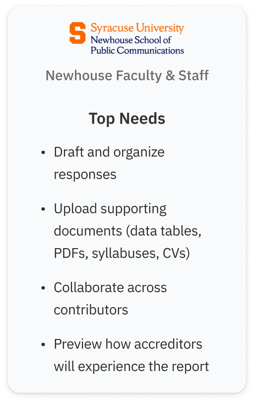
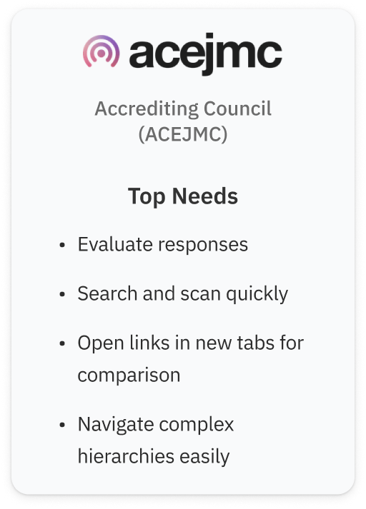
Understanding the Dual-User System
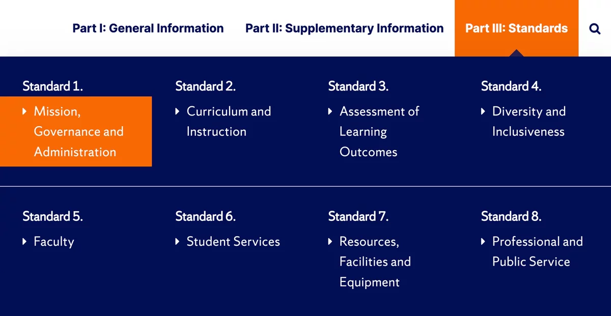
To meet accreditation requirements, we needed to upgrade the self-study from a dense, static document into a fully navigable, web-based experience. Our two main user groups had very different priorities:
- Newhouse faculty and staff needed to draft and organize answers across dozens of accreditation standards, often collaborating asynchronously.
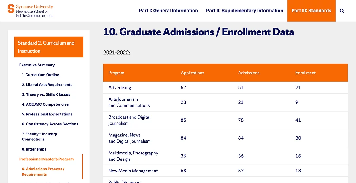
- External accreditors needed to quickly find and evaluate specific answers, documents, and data tables, without getting lost in deep hierarchies.
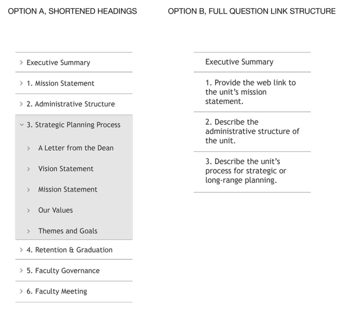
Validating Navigation Approaches Early
We explored multiple navigation approaches in low-fidelity wireframes early on, validating assumptions through stakeholder feedback before investing in visuals or CMS development.
Designing in Ambiguity
We had to ship an MVP that worked before any content existed and support a dual-user system with very different needs. Our design decisions needed to anticipate structure, flows, and customization without waiting for final input.
We asked:
- How will Newhouse contribute content?
- How will accreditors consume and evaluate it?
- What UI flexibility do both groups need?
The result: a scalable, user-friendly framework flexible enough to support long-form content, supporting documents, and evolving requirements.
Provide Context, Realistic Goals, and a Clear Future
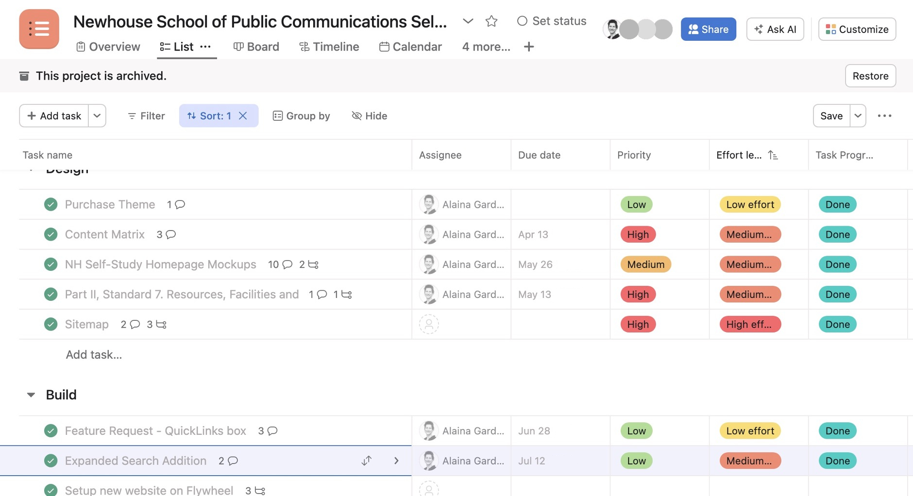
Built from a refined custom template, I used Asana integrated with our other tools to guide the team through multiple iterations. The roadmap helped:
- Provide context for user stories within epics (streamlined navigation, search, etc.)
- Tag and sort by high priority/low effort
- Show deadlines and dependencies at a glance
- Keep details documented and accessible
- Align the team around strategic goals
Designing for Easy Scanning and Accessibility
To meet accreditor expectations and WCAG 2.1 AA standards, we designed an interface that emphasized:
- Full visibility of all questions (no hidden or collapsible content)
- Scan-friendly layouts for long-form answers and data tables
- Clear content hierarchy and intuitive navigation
- Accessible markup, structure, and interaction patterns
Validating with Real Content and Real Users
Once the foundation was in place, Newhouse began populating the platform with real content. This allowed us to:
- Observe how users navigated and filled out standards
- Gather feedback from key stakeholders, including the Dean
- Uncover usability friction through real-time insights and questions
- Prioritize improvements based on observed behavior and qualitative feedback
Results: Flexible, Efficient, and Built to Last
Newhouse staff called it the best CMS experience they’d had (both front- and back-end).
Accreditors called it “a work of art,” praising how effortless it was to find information in a complex and rigorous report.
Fully WCAG 2.1 AA accessible and QA tested.
I led this project while Head of UI/UX Design at Idea Kraft.