From Magazine Layouts to UX Design: A Decade of Understanding Users
Published on September 6, 2024
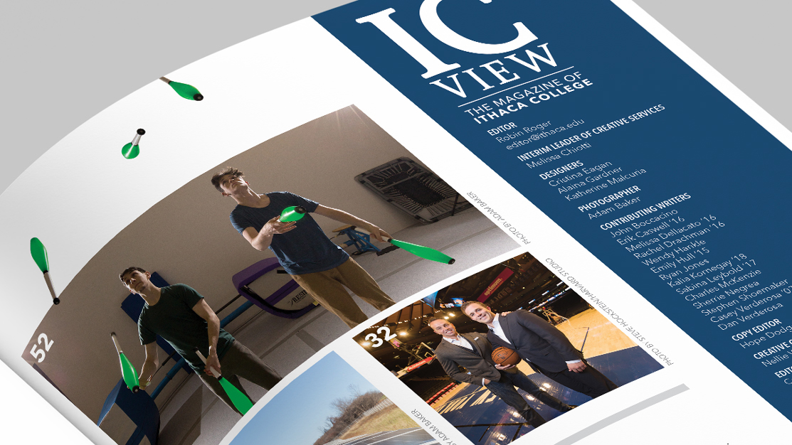
One of my first design jobs almost 10 years ago was working for Ithaca College Strategic Marketing and Communications. I was hired because they were undergoing an entire website overhaul, but I also did design work for the magazines (and got to work with an amazing photographer Adam Baker). I remember one of my favorite things was designing layouts for the magazines because I would dive into the stories and understand them before coming up with a design solution. It was all about staying on brand while also pushing that boundary to add reader delight, not unlike adding user delight in UX design. A silly example is allowing these jugglers to juggle outside of the magazine grid system.
I was thinking about this and how similar it is to what I do now with user experience (UX) design. Even in my senior role, my favorite thing is still deeply understanding the users no matter how different they are from me, and then innovating based on their needs. There’s an intimacy in first understanding, then rethinking the requirements, asking the right questions, and ensuring that you’re solving the right problems. This approach is the foundation of my work in product design, and it has never led me astray.
Start with a deep understanding, and you’ll embark on your design journey prepared to invent. Whether it’s an animation in a SaaS application, the perfect user onboarding that makes an IT administrator love your product, or just some silly juggling pins, it’s all about solving the right problem with thoughtfulness.