Designing a Consistent Notification Experience Across Multi-Platform Products
Published on September 16, 2024
Recently, I launched a design system for notifications within a multi-platform SaaS application. While the process benefited greatly from valuable input and questions from my team, I’ll be talking about this in broad terms to maintain confidentiality. Some specifics have been adjusted, drawing on other experiences from my career.
What Do I Mean When I Refer to Notifications?
Notifications include:
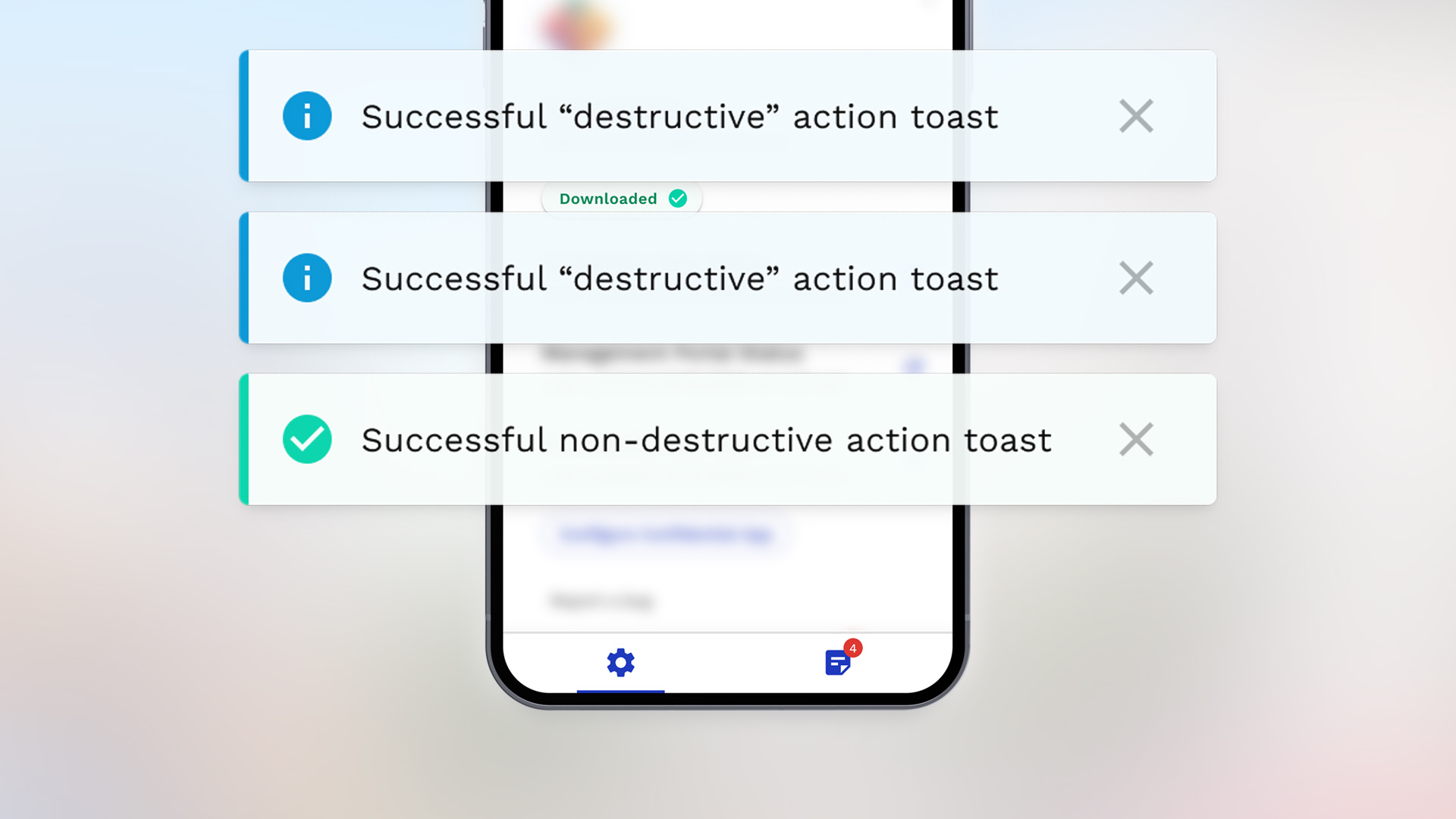
- Toasts (the temporary messages you see pop up on your screen to remind you that a meeting is starting, to let you know that a request has been sent, or to confirm that a post has been saved, for example)
- Inline error feedback and inline validation (the red text you see under a form field you forget to fill in is a good example of inline error feedback)
- Status indicators (the animated loading button that indicates success or failure once loading completes)
- Alerts (system errors, security alerts and other urgent warnings)
- Modals (popups that take over your screen)
- Badges (usually a number that appears to show how many pending notifications you have)
Where Does Design for These Start?
In this example, we’re focusing on two product areas: one that’s mature and well-established, and another that’s still in its early stages of development. The future stages haven’t been fully defined yet, but it’s likely that one of these areas will require a complex notification system, including notification management for users.
One of my roles in leading the UX design strategy is to plan for the future. In the case of notifications, it’s especially important to establish consistency across an application’s multiple interfaces. They should look and function similarly, because users learn to expect them to behave a certain way, and following expected behavior becomes important to avoid confusion. While designing for these two priority product areas, I also defined the high-level functional requirements for the future product areas. This ensures consistent and holistic planning across the entire application, enabling us to maintain uniformity.
The Role UX Writing Plays in Shaping Consistency and User Expectations
Once I define how each type of notification appears and behaves, it is essential to extend the design system to cover language as well. This included everything from modal titles and descriptions to button labels, error messages, and more. If you’ve ever tried to use an interface where naming conventions and labels kept changing, you know how confusing that is! Clear UX writing eliminates that confusion and helps users interact with ease.
Challenges in Aligning Stakeholders
This may sound silly but one of the biggest challenges in this example was getting stakeholder buy-in on toast notifications. A stakeholder disliked toast notifications in general, regardless of the application. We follow an agile process, and at this point, we were only on the first iteration. I had designed initial mockups and user flows for success toasts, informational toasts, and error toasts. When the result of an action occurred outside the immediate screen, an “Undo” button was included in the toast design.
When a stakeholder’s personal preference conflicts with best practices for the user, I always try to understand why they feel strongly about it so we can address the concern. You can look at these obstacles, too, as valuable insights to be uncovered. In this case, the stakeholder experienced anxiety in their day-to-day use of software products when too many notifications stacked up. I had already based the functional specifications and designs on preventing excessive stacking, and we agreed to adjust our approach further by displaying confirmation toasts only when there was no immediate visual indication that the action was successful. For example, it’s visually obvious when a switch component toggles between inactive and active, so a toast isn’t necessary. But when an item is restored from the trash or moved to the trash, a toast notifies the user of success and provides the option to undo it.
Setting the Stage for Future Success
Designing a notification system for a multi-platform SaaS application comes with unique challenges. Ensuring application-wide consistency across platforms and product areas isn’t a minor detail, and consistent language warrants attention and user testing. UX writing plays a critical role in making the application easier to use. The easier it is to use, the faster customers will see value in the product they’re investing in. Quick methods like highlighter tests, tracking clicks, or spending just a few minutes observing and interviewing users can provide valuable insights without taking time away from exciting features. If you think user research has to be complicated or time-consuming, think again. The benefits are well worth the effort, and your product will be set up for a successful future.